Supply-Demand Ratio
The supply-demand ratio is just one market indicator featured in our monthly market reports. This article looks more closely at what this ratio means and how it applies to our local real estate market.
The supply-demand ratio is calculated using the inventory at the beginning of the month and the number of listings under contract at that time. The ratio is the number of active listings that are available for each buyer.
High supply-demand ratio = Higher inventory, lower sales, lower demand for homes, “Buyer’s Market”
Low supply-demand ratio = Lower inventory, higher sales, higher demand for homes. “Seller’s Market”
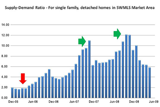
Let’s take a look at some examples from the chart below. (To see a larger version of the chart, click here)
Example 1: The two green arrows on the chart indicate a high supply-demand ratio. In December 2007 the ratio was 10.97, and in November 2008 the ratio was 12.09, both winter months. During these months, buying activity was down. The higher supply-demand ratio was caused by the higher number of listings on the market and a lower number of listings under contract.
Example 2: The red arrow on the chart indicates the lowest point of the ratio, 1.73 for February 2006. It is interesting to note that this is also a winter month, and low supply-demand ratios are unusual during that season. During this time, the market inventory was significantly lower, and more offers were being written. Both signs contribute to a "seller's" market, since fewer homes were available on the market.
Comments (0)
There are no comments for this entry.